2026 / Airbus / Shipped
Scaling multi-zone configuration in computer vision pipelines

/ context
Designing for computer vision operations at Airbus
in december 2025, I joined Airbus’ advanced analytics & AI division as a product designer.
this case study explores my contributions to the organization's internal computer vision platform.
/ impact
the multi-zone redesign shipped in feb 2026,
with early impact proving improved feature adoption
adoption metrics
data over 2 months
number of multi-zone pipelines created on the platform
32 % increase
total pipelines using multi-zone configuration
46% , from 14 % previously
/ background
but what even is computer vision?

visual intelligence for operations
computer vision is a field of AI that enables computers to interpret and understand visual information from visual data

the product
a centralized platform for building and deploying computer vision solutions

core offering
a visual studio for building and deploying computer vision pipelines
/ bringing you upto speed
and zone configuration? what’s that?

spatial filtering
zone configuration lets users define specific areas within a camera view where inference and analysis should be performed
/ the problem
earlier, users could only define one zone.
but now, they could start configuring up to five
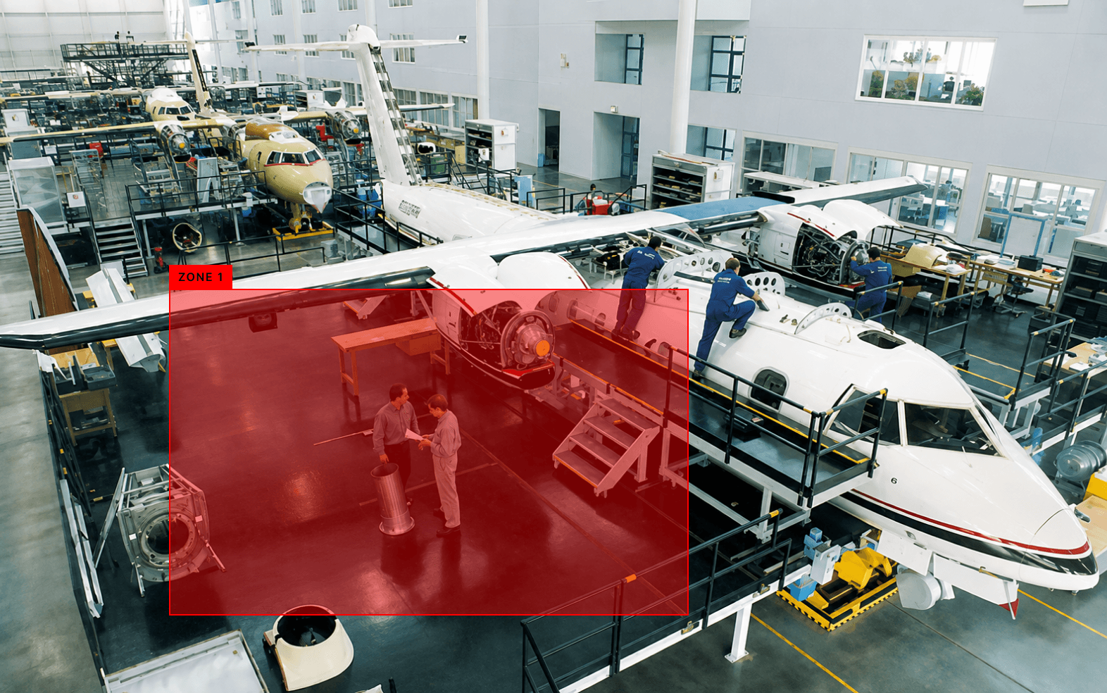

MARKING JUST ONE ZONE WAS STRAIGHTFORWARD
MULTIPLE ZONES?
THE COMPLEXITY OF IMPLEMENTATION HIT USERS


/ whoops. what else went wrong?
pressure to meet scrum deadlines led to the feature shipping with design debt that ultimately users paid for

Treats all objects at the same level,
no object level customization
User can draw multiple zones on canvas,
but there is no indication of such
User needs to click on the zone titles to open the corresponding panel, no affordance
/ phrasing the problem
how might we
help users easily define multiple zones and configure models in them?
/ iterating
idea one:
tabbed zone management

Fields to configure models objects wise
Segregating zone management into tabs
tradeoffs in this approach:
made zone creation more discoverable, with zones organized at the top level
single configuration panel bundles multiple optional model settings, increasing cognitive load
/ iterating
idea two:
zone management at pipeline creation
the idea was to capture the user intent at the start, to avoid complex configuration controls later
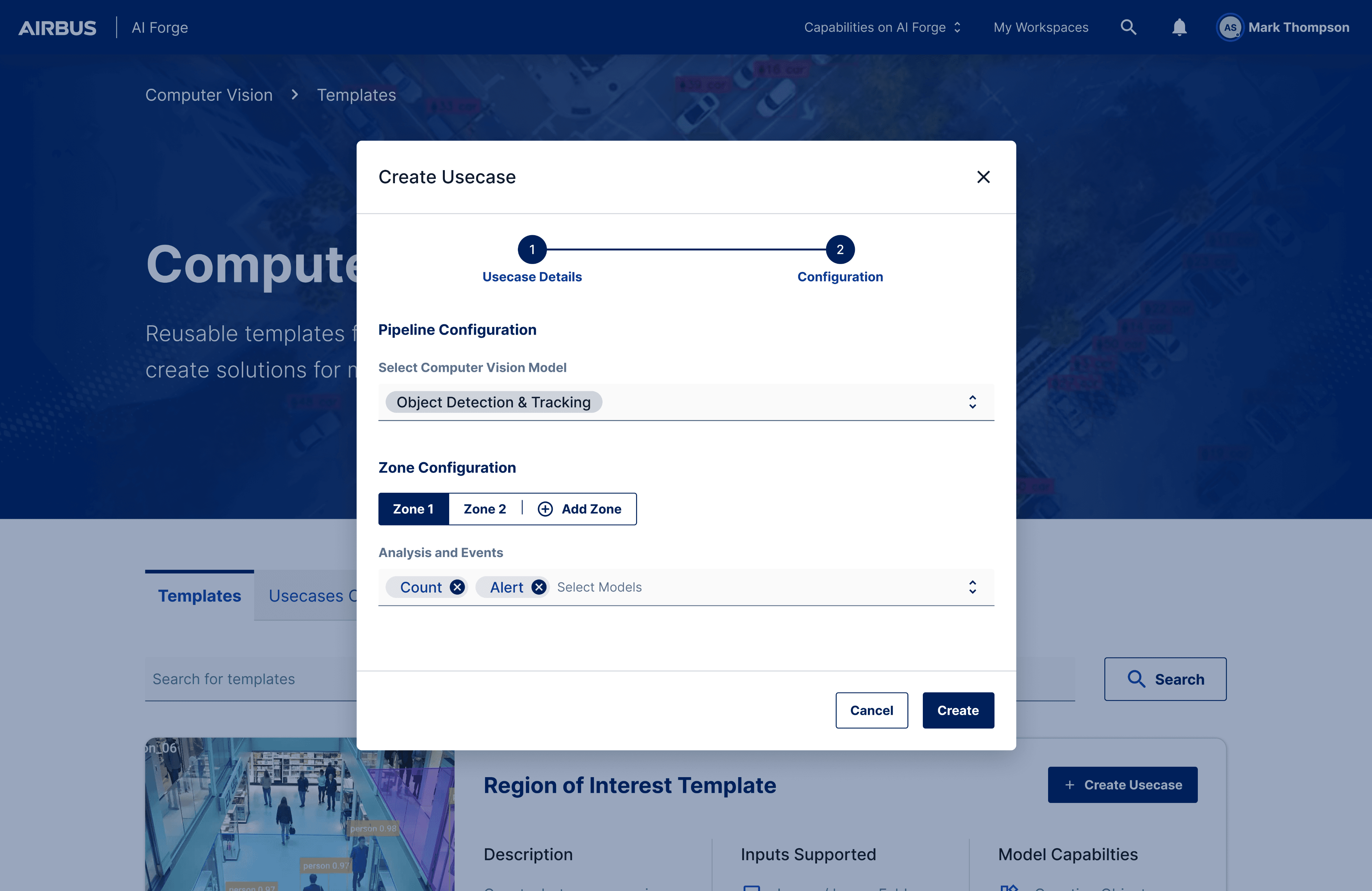
zone management at pipeline creation itself
why this is a bad idea:
difficult to plan zone details without the entire pipeline context
user still needs to mark zones later, so this doesn’t eliminate the effort it was trying to
/ back to the drawing board
dealing with changing feature requirements:
including even more layers of customization for model inference!
LVL 01
CREATING A ZONE
UPTO 5 ZONES
LVL 0
ZONE CONFIGURATION NODE
LVL 02
CHOOSING ANALYSIS MODELS
EX: COUNT OBJECTS, ALERT WHEN, ETC
LVL 03
SELECTING OBJECTS FOR EVERY MODEL
CHOOSING CLASSES FOR MODEL ANALYSIS
levels of customization originally planned:
LVL 01
CREATING A ZONE
UPTO 5 ZONES
LVL 0
ZONE CONFIGURATION NODE
LVL 02
CHOOSING ANALYSIS MODELS
EX: COUNT OBJECTS, ALERT WHEN, ETC
LVL 03
SELECTING OBJECTS FOR EVERY MODEL
CHOOSING CLASSES FOR MODEL ANALYSIS
LVL 04
SELECTING AN EVENT FOR MODEL PROCESSING
WHEN TO COUNT? WHEN TO ALERT? ETC.
additional level added midway:
/ back to iterating
idea three:
progressive panel approach for multiple levels of filtering
an exploration; there’s so many actions, how do we fit them in a single modal?
tradeoffs in this approach:
supports the granularity in customization required
excessive nesting depth causing cognitive load
too many user goals in a UX pattern meant for focused tasks (Modal)
/ iterating
idea four:
splitting the user goals into different nodes
till now, a single workflow node was responsible for 2 tasks: area definition and model configuration

single function nodes
the two user goals are split into two steps now, visually mapped on the pipeline canvas

zone configuration in a modal
the user only defines the zone in the zone configuration node now, leaving model configuration to further steps, reducing the load here

model configuration
the user can connect each zone to the model node as required, which helps them visualize the flow of data better
tradeoffs in this approach:
separation of concerns, a granular pipeline is easier to understand and debug
the user is required to manually place and connect model configuration nodes
multiple branches can clutter the canvas and scale poorly
/ user testing
feedback from users after testing:
no clear design won! users pointed out things working and ones that weren’t

what users preferred
users preferred the complex multi-panel approach because they could preview the zone while configuring models
what users pointed out
non-power users found it tough to build their own pipeline and add workflow blocks
/ final solution
idea five, the final design:
bringing user feedback from previous iterations together

/ adding a visual preview
adding a zone preview provides context on how information maps between space and models
/ compressing model configuration options into a single node
the ‘event analysis’ node auto appears mapped to each zone, instead of users selecting single models
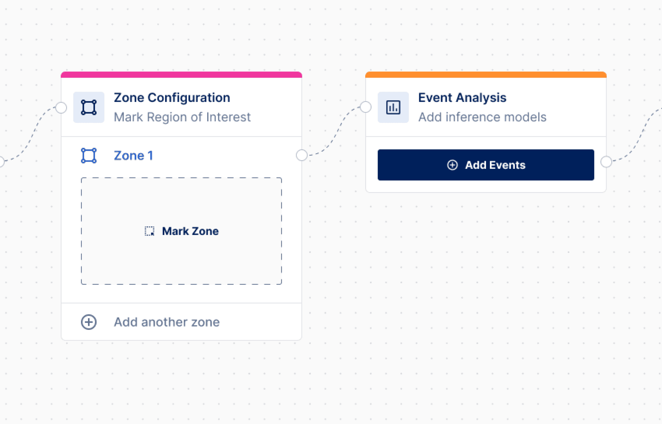
default state
each zone auto-maps to an event analysis node by default

all models in a single place
placing all model options together saves the user the effort of building this part ground up
why I decided this worked:
templatizes the pipeline, making it easier for non-power users
visual flow of data in the pipeline is clear
compresses configuration complexity
/ conclusions & learnings
/ the change in perspective question framing brings
my ideas radically improved when I shifted from designing for tasks to designing for outcomes.
/ put the bad ideas on canvas too
though initially hesitant, bad ideas helped me define creative boundaries & find unobvious feedback.
THANK YOU FOR READING :)